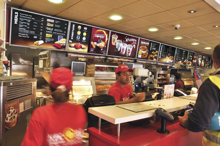
The launch of new products and meals had caused KFC’s menuboards to become visibly cluttered, impacting negatively on customers’ brand experience. Set against a recessionary backdrop, KFC needed a radical point-of-sale solution.
Briefed to make KFC’s menuboards work harder, Design Bridge plunged into menu research, observed customer ordering patterns and conducted in-depth sales analysis. The agency then set about reconfiguring the KFC menus, aiming to improve food values, enhance navigation and optimise space. They created a consistent palette for promotions and shifted from beige to brown menu backgrounds. They also combined panels and repositioned products, moving snacks away from meals to help improve sales.
By reducing visual clutter and confusion and increasing awareness of promotional items, the simplified menuboards have positively enhanced consumers’ point-of-sale experience. They were found to be ‘very appealing’ by 33% of consumer survey respondents, and have proven to deliver incremental +1.1% same-store sales growth.