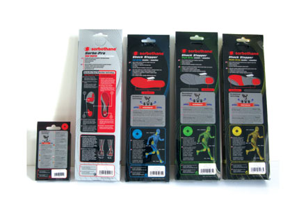
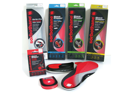
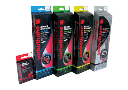
Sorbothane’s product packaging had become out of date and dysfunctional. A radical redesign was needed to substantiate the company’s leadership position in the insole market.
Design Activity were briefed to revolutionise Sorbothane’s packaging line. Given a free reign to look at both structure and graphics, the agency began developing three key elements: strong vertical branding to reflect Sorbothane’s leadership credentials; clear technical communication about the products’ shock-absorption and foot-protection systems; and a consistent wave-form pack layout flexible enough to allow for multilingual application. The result is a striking range of packs that communicate modernity and authority and create a powerful in-store presence.
The new packaging has certainly put a spring in Sorbothane’s step. Since the redesign year-on-year sales have gone up 34.8%, equal to a £460,000 sales uplift; product returns are down 40%, and new distribution opportunities have opened up in Spain, Italy and Germany.