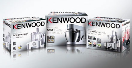
Despite following a design template, Kenwood’s product packaging was inconsistent and out of step with its brand values. In 2008, the company decided the time had come to put things right.
As a first step, Kenwood agreed a set of ‘brand fundamentals’. BOS were then challenged to develop a consistent packaging approach that would ensure all visual articulations of the brand reflected those fundamentals. BOS responded by bring clarity and uniformity to the Kenwood product lines. Stunning photography, using heroic angles and dramatic lighting, helped to increase quality perception. Text, meanwhile, was kept to a minimum to communicate ‘reasons to purchase’ without creating clutter or confusion.
Clarifying the Kenwood brand, BOS’s solution led to a phenomenal increase in sales. The year following the re-launch was Kenwood’s most successful to date, with sales of kitchen appliances in Europe up 15.5%. Share value also increased in the UK from 43% to 47.5%.