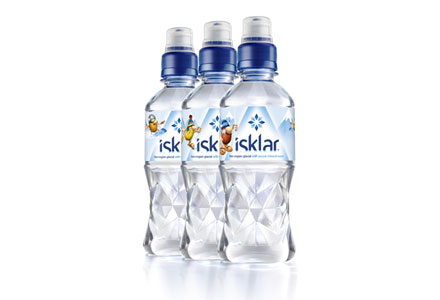
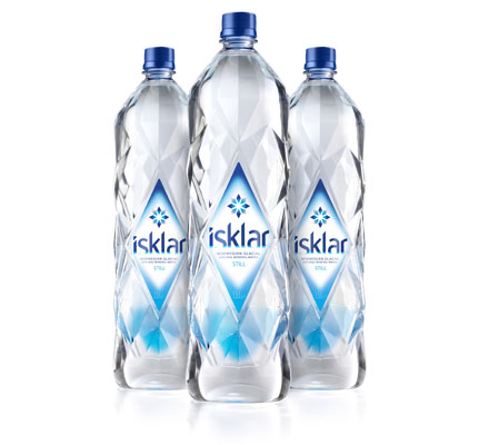
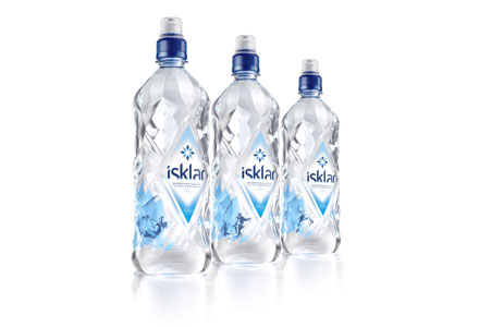
Having found one of the world’s purest waters, Isklar needed a truly show-stopping bottle to make an impact in the fiercely competitive UK mineral water market.
Blue Marlin were issued with a one-word brief which said, quite simply, ‘wow’. They began by defining the brand proposition, focusing on the glacial purity of Norwegian water. The bottle design encapsulated this proposition, drawing inspiration from the pristine wilderness of Isklar’s source. A faceted brand icon was developed using various shades of blue, echoing the colours of compacted ice. This was positioned to rise above a distinctive angular typeface reflective of glacial structures, while the labels were blended into the bottle to communicate sophistication and purity.
In the 52 weeks to April 2010, Isklar grew by over 619% in value terms, making it the second fastest growing brand in the market. It has gained listings in most major multiples and achieved sales of almost £2 million a year.