

In mid-2008, having lost its leadership position to Warburtons, Hovis was in serious trouble. The time had come for a major packaging overhaul to halt the decline in sales and market share.
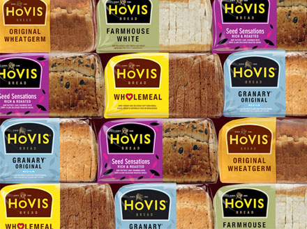
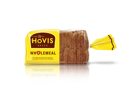
Jones Knowles Ritchie were called in to help renew customer confidence. Knowing that consumers were questioning the relative goodness of Hovis, Jones Knowles Ritchie came up with a package design that left half of the product bags clear, enabling the quality to show through. They also utilised a traditional Hovis logotype to draw upon the rich visual equity of the brand. Bright colours were employed to catch the eye and facilitate habitual selection, while a retro-progressive look was created to imply authority in an aisle of frenzy.
By the end of the year, Hovis had staged a remarkable turnaround. Sales went up 14%, with a 5% recovery in market share and a £57 million increase in grocery sales.