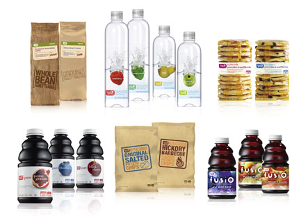

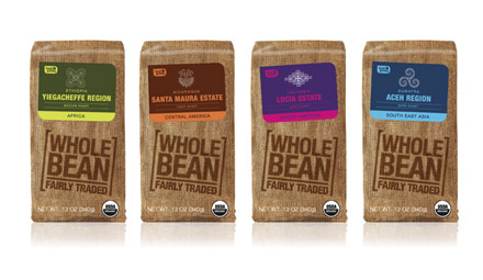
Tesco’s expansion into the US grocery market was never going to be easy. The retailer knew it couldn’t simply import a successful UK format and expect results. An entirely new brand was needed.
P&W Design, working alongside US advertising agency Deutsch LA, were briefed to create a new brand that would achieve the necessary cut-through. The result was Fresh & Easy. But rather than a monolithic identity, P&W set about developing a ‘visual glue’ to give the range coherence and flexibility. The visual glue was based on three principles – clarity, food values and authenticity – that were used to guide packaging design.
With 600 SKUs designed in less than seven months, the new range launched in California in 2006/07. The packaging has played a major role in communicating brand values and establishing customer loyalty. Fresh & Easy continues to drive Tesco’s venture in the US, where its sales are up 58% year on year.