
Waitrose wanted to increase awareness of its own-label everyday products and raise the profile of its in-store identity. Looking for a clear entry price-point without any compromise on quality, they sought to broaden the appeal of their brand without alienating loyalist customers.
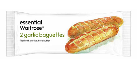
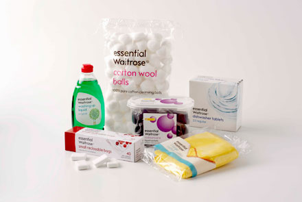
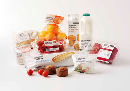
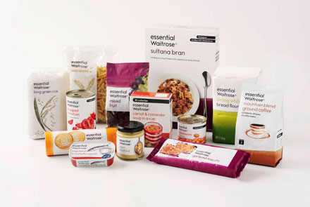
The Waitrose graphic design team were briefed to create an identity that would be bold, unique and consistent across all ‘everyday’ categories. They responded with ‘essential Waitrose’, avoiding the words ‘value’ or ‘basic’ to reassure customers of the ongoing commitment to quality. A new distinctive visual identity also reinforced Waitrose’s market leadership credentials, with flat white backgrounds accommodating both illustration and photography.
The launch of essential Waitrose delivered the most impressive results in the company’s history. In the first 12 weeks like-for-like sales grew by 16%. After 12 months essential Waitrose had become a £1/2 billion brand accounting for around 17% of sales, leading one commentator to suggest that Waitrose had “simply shrugged off the recession”.