Since its heyday in the 1970s and ‘80s, Smithwick’s market share had been in decline for 15 consecutive years. Despite its heritage and brewing credentials, the Smithwick’s brand had become dusty and outdated. This great Irish ale was on its knees.
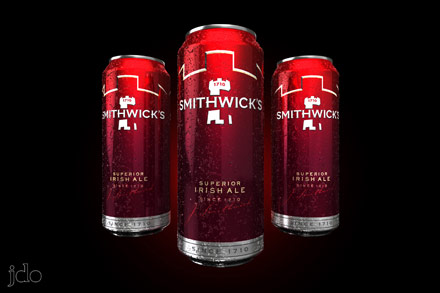
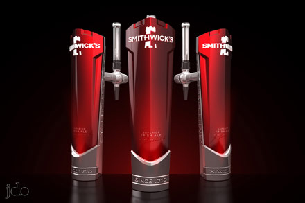
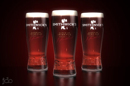
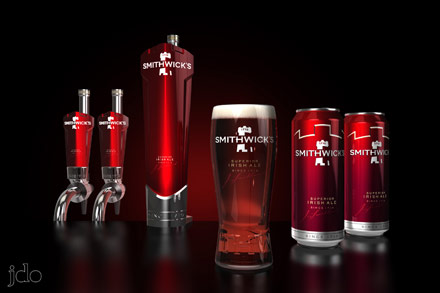
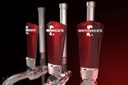
JDO were tasked with creating an outstanding brand identity to help woo back once-faithful drinkers and introduce Smithwick’s to a younger target audience. Calling upon Smithwick’s rich history, JDO shifted the product logo from a clichéd emerald green to a deep burgundy red, reflecting the colour of the ale itself. They also used an elegant yet robust type typeface, and redesigned the fount and glass to communicate confidence, pride and strength.
The new design paid for itself in 2.8 days, and Smithwick’s has become the fastest-growing LAD brand in the West of Ireland, having gained over 1.4% percentage points. It is now the one Diageo brand that is growing share across all eight sales regions – consistently.